Ron Paul Digital Billboard Series Fundraising Thread - Des Moines, Iowa

1.) The "URL" at the top of the last 4 boards, (boards 2-5) will be edited as the first board demonstrates.
2.) The "Paid for" will be added to Boards 2-5 and minor structural tweaks will be made.
3.) A differing selection of "Gentle, Smiling Paul" portrait photos will be applied to the Boards.

BRANDING - BRANDING - BRANDING

============================ 1 ==========================


RP Digital Billboard - IOWA - Series 02 - Board 01 - v01-05_Rough-Product 01 by RonPaulBillboards, on Flickr

============================ 2 ==========================


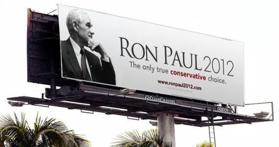
Ron Paul Digital Billboard - Iowa Series 01 - Board 01 of 04 by RonPaulBillboards, on Flickr

============================ 3 ==========================


Ron Paul Digital Billboard - Iowa Series 01 - Board 02 of 04 by RonPaulBillboards, on Flickr

============================ 4 ==========================


Ron Paul Digital Billboard - Iowa Series 01 - Board 03 of 04 by RonPaulBillboards, on Flickr

============================ 5 ==========================


Ron Paul Digital Billboard - Iowa Series 01 - Board 04 of 04 by RonPaulBillboards, on Flickr

========================================================

These images, may force you to scroll the forums window from left to right. (Press the "F11" key in windows for "Full Screen").

They are in the technically correct size for immediate placement on any board, anywhere in the nation. (1440pixels in height by 400pixels wide)

Boards 2-5 needs some adjustments as mentioned in the top of this post. This will be done very soon.

Pledges?
 
Last edited:
Mocked up a version with Ron's face on there. Slogan can be changed from time to time, each day if we want. Beauty of digital.

rp2012billboard2.jpg
 
Mocked up a version with Ron's face on there. Slogan can be changed from time to time, each day if we want. Beauty of digital.

rp2012billboard2.jpg

I dig it! We should run with three or so messages to start.
 
Mocked up a version with Ron's face on there. Slogan can be changed from time to time, each day if we want. Beauty of digital.

rp2012billboard2.jpg

The portrait selection is great. The skin tones are highly inaccurate, not the healthy, glowing Ron Paul that I know.

I don't understand your persistence in using the "light blue" 2012 on a blue background. Do you have any technical justification for this sir?

The URL is "nuisance" text, it's so small that it will not be legible to anybody more than 200 feet from the board.

Your use of "OPEN SPACE" "WHITE SPACE" is a gigantic violation of Digital Billboard Design Best Practices.

"The Only True Conservative Choice" is too small.

RELEASE, LET GO, SURRENDER to Best Practices and you will be a Digital Billboard Designer.

Have you read the Opening Post sir? Please, read the opening post. The finest Digital Billboard designer IN THE WORLD, lays out the Best Practices of Digital Billboard design in the Opening Post, please, read the Opening Post thoroughly and understand it. I am not this person, and you are not this person. He works for Clear Channel Digital Billboards in a position of great power and influence. If you will "release" you will honor his position in the industry and we will have a better opportunity to arrange a favorable business position with Clear Channel.

I appreciate your participation in this thread by posting your designs but I must demand you read the opening post and abide by the Best Practices of Digital Billboard Design. Butting heads is NOT what Dr. Congressman Ron Paul would have us do. RELEASE the artistic ego ... NOW.
 
Play off of the motto on the Iowa flag from my wife:

Our Liberties We Prize, Our Rights He Will Maintain
 
The portrait selection is great. The skin tones are highly inaccurate, not the healthy, glowing Ron Paul that I know.

I don't understand your persistence in using the "light blue" 2012 on a blue background. Do you have any technical justification for this sir?

The URL is "nuisance" text, it's so small that it will not be legible to anybody more than 200 feet from the board.

Your use of "OPEN SPACE" "WHITE SPACE" is a gigantic violation of Digital Billboard Design Best Practices.

"The Only True Conservative Choice" is too small.

RELEASE, LET GO, SURRENDER to Best Practices and you will be a Digital Billboard Designer.

Have you read the Opening Post sir? Please, read the opening post. The finest Digital Billboard designer IN THE WORLD, lays out the Best Practices of Digital Billboard design in the Opening Post, please, read the Opening Post thoroughly and understand it. I am not this person, and you are not this person. He works for Clear Channel Digital Billboards in a position of great power and influence. If you will "release" you will honor his position in the industry and we will have a better opportunity to arrange a favorable business position with Clear Channel.

I appreciate your participation in this thread by posting your designs but I must demand you read the opening post and abide by the Best Practices of Digital Billboard Design. Butting heads is NOT what Dr. Congressman Ron Paul would have us do. RELEASE the artistic ego ... NOW.

It can be beautiful and effective at the same time, you're "guidelines" are a bit over the top here. You can't tell me anyone looking at that would not not do a double take, then quickly absorb the message and go about their day. Mission accomplished.
 
Last edited:
They are NOT my guidelines!

Those guidelines are straight from Corporate Clear Channel digital Billboards, one of the finest and most respected Digital Billboard creators in the United States of America.

Release me.
 
It can be beautiful and effective at the same time, you're "guidelines" are a bit over the top here. You can't tell me anyone looking at that would not not do a double take, then quickly absorb the message and go about their day. Mission accomplished.

The person in the automobile does NOT have time for a "doubletake", this is what we must avoid. They are traveling at 70 miles per hour. The URL is illegible, it is "nuisance text".

Please, do not credit me with the hard work of another person.

The guidelines are straight from the most well respected Digital Billboard Designer in the world, who works in a position of authority at Clear Channel.

I do not work at Lamar, I do not work at Clear Channel.

The skin tones of Dr. Congressman Ron Paul in this mock up are not beautiful.
 
They are NOT my guidelines!

Those guidelines are straight from Corporate Clear Channel digital Billboards, one of the finest and most respected Digital Billboard creators in the United States of America.

Release me.

When submitted to Clear Channel, the Creative guy there can submit suggestions. AdamT will be in contact with him. This doesn't have to be the best digital billboard in history, but it will be the first, it will catch the eye, and it will get attention for Ron Paul. And it may spark the creative juices of others who want to submit their ideas.

I apprecaite your passion to stay within the established rules of digital billboard design.

So, this is our mock up. Who's in for $$?

Everyone, please continue to post short phrases for the boards.
 
Last edited:
Last edited:
So, this is our mock up.

Can you please provide the Board participants, lurkers, pledgers, and potential donors with a clear post that specifically quotes the image that is going to be used. We don't want board participants to think the board was pre-selected and championed by those that are in control of the donations. Heaven forbid that the actual designer of the board is in control of the funds at the PAC.

This is PAC money, not chip-in as ultimately the money goes to the PAC. If it were Chip-in, true roots and not a PAC things would be different.
 
A couple other designs courtesy of Justin Page Wood.

rp2012billboard3.jpg

rp2012billboard4.jpg

rp2012billboard5.jpg
 

Attachments

  • rp2012billboard4.jpg
    rp2012billboard4.jpg
    99.6 KB · Views: 0
Last edited:
A couple other designs courtesy of Justin Page Wood.

rp2012billboard3.jpg

rp2012billboard4.jpg
Very nice. Not quite sure if I like the white background, or the blue one better... I think I like the color photo of Ron Paul better then the black and white photo, makes him look younger.
 
Back
Top