The thing about the last ones is you can't read the information as small as avatars are. The NOBP ones mostly had that issue, there were only a couple to choose where you could read the date of the money bomb. This is a big point to me because I often 'log in' with my twitter account on comments and I'd like to leave a short version advertisement of the date of the money bomb even if my comment isn't on that. Could there be some with really large date and Moneybomb or something?
Also, the last 'it' is missing. I'm assuming you did that on purpose?
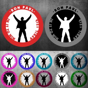
Yea the problem with working with twitter avatars is they scale down to 48x48 which at that point you have a choice, either limit amount of text that is readable and go with recognizable branding, go with no text and just a brand, or go with just text and no graphics so that its readable.
What we will end up doing is something similar to what we did for NOBP which is to have various different version of the logo for Twitter specifically we'll add the date again underneath or above the image so that it is readable at 48x48 like we did with some of the smaller avatars such as these:
There were some 23+ more twitter examples here:
http://www.noonebutpaul.com/promote/#avatars
For now the initial step is to focus on branding, once the branding is finalized then we can do different things with how we actually implement it, but the idea with this logo is that even if you never read any text with enough people changing their avatar over time the text actually loses its meaning and the symbol is what gets communicated. For example with STOP SOPA their branding symbol was this:

Which is essentially a European stop sign, after a while it became easily recognizable because everyone was using it, for those that didn't know about the date or time or event or what it all means, they asked because they saw lots of different people using it and then used it themselves for their profile pictures. In the same grain of a picture is worth a thousand words something at 48x48 needs to communicate a message visually and something we can reuse at different sizes with different applications else we might as well just stick to text and in which case I'm not sure how many people would adopt it as their own when accessorizing a their profiles. We will be using the logo with different text and there will most likely be different versions of the logo depending if its to be used for the site, avatar (facebook or twitter), banners, etc.
And yes as I mentioned in previous post it's missing the last word "it", typographical error.
")
Fixed logo with avatars will be released most likely later today.


but I went through & posted them individually so 220 posts later...

 , should bring a decent clip of traffic to the event page and spread the word about the money bomb.
")