Website Redesign Concept Image (Took me 6 HOURS to Create in Paint, PLEASE LOOK!)

Sentinelrv

Member
Joined
Jan 5, 2008
Messages
2,811
Ok, I didn't plan on doing this, so here is how it started. On the chipin thread, TexMac raised some very serious concerns about the current website design. Here was my reply...

Gage, I believe TexMac's criticisms of the website are valid. I know you're doing the best you can and we appreciate everything, but with a website like this, you only have a couple seconds to capture people's attention. If it's not immediately clear to them the purpose of the website, you just lost a potential pledge whether you like it or not. You need to catch people's attention IMMEDIATELY. If you make them think, then you lose.

He brought up a question about the title "Support Them Now". Newcomers visiting the website might ask the question "Support who"? If people are required to read the description first in order to understand the event is about supporting the troops, then you've already lost. Reading should not be required in order to understand what the event is about. It needs to pop out at you visually. For example, if you were to take the title "Support Them Now" and combine it with a soldier instead of that old picture of Ron Paul, they would immediately connect the dots. With the current setup, if given only a couple seconds glance at the website, it's much harder for a person to connect the dots.

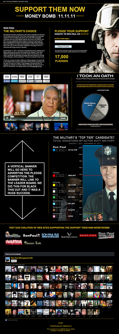
So I decided to take Dusman's military donations ad here...

Fullscreen%2520capture%252010282011%252052407%2520PM.jpg


...and design a website around it using Microsoft Paint, yes that's right, PAINT! I don't know how to use Photoshop. Anyway, it took me 6 hours to finish and I think it turned out pretty good. I changed the wording a little bit in the description. It now mentions the military donations straight off the bat to fit with the overall theme of the website. I also added our pledge goal and made the suggestion to donate $100, like we did on the Nov 5th website. I even added the donation graph in an easily viewable part of the website. The only thing I didn't add was a banner for the leader board competition. With this design, I think anyone can IMMEDIATELY tell what "Support Them Now" actually means. The dots will be connected, and then they can read the description and find out HOW they can support the troops. One note, the link in the upper left hand corner of the website takes you to my planning thread on RonPaulForums where you can help out in the planning stages and learn how to promote. Please tell me what you think. Is this something we should switch to?

Click the picture to make it LARGER...

 
Last edited:
Not bad for paint, lol.

OK, on the first line of your text, replace with "Why are the top 3 contributors to Ron Paul's campaign the US Army, the US Navy and the US Air Force?"

Cite for that statement: http://www.opensecrets.org/pres12/contriball.php?cycle=2012

Then, 2nd sentence: "Ron Paul receives more donations from the military than all the rest of the GOP candidates combined, and more than Barack Obama."

You really did a good job with this.
 
Last edited:
I can't say I disliked the current one, but I do find this one more engaging.
 
This one communicates the idea of the moneybomb in one glance. That's the most important thing. Let's get it up so we can start pushing it.
 
Then, 2nd sentence: "Ron Paul receives more donations from the military than all the rest of the GOP candidates combined, and more than Barack Obama."

yes, definitely! This point cannot be emphasized enough! And isn't it almost twice of the GOP candidates combined?

I LOVE the look of it, it's crisp and clean.
You did a great job on this.

- The other graph "military's top tier" really should be on there.
Thats the most eye-opening one, plus it has a picture of Ron Paul in uniform.

- Should it really have "Ron Paul's" above the "support them now". It doesn't sound right.
It still makes it seem a little misleading as to where the donations are going.
Maybe just the support them now can stand alone. And instead, have it say:

Ron Paul
The Military's Choice

and then maybe in bold at the end of the paragraph:
On this Veteran's Day, please help support Ron Paul, the... (not sure... someone help me out here, I have writer's block all of a sudden. Something about supporting Ron Paul, the choice of the military or... support the troops by supporting their choice, arggh I'm stuck..help.)

-Veteran's Best Friend has to be somewhere on this thing.
I realize the name can't change at this point.
But "Veteran's Best Friend" sounds the best out of all of the other slogans.
and it IS Veteran's Day.
 
Last edited:
Ok, I didn't plan on doing this, so here is how it started. On the chipin thread, TexMac raised some very serious concerns about the current website design.

So I decided to take Dusman's military donations ad and design a website around it using Microsoft Paint, yes that's right, PAINT! I don't know how to use Photoshop. Anyway, it took me 6 hours to finish and I think it turned out pretty good. I changed the wording a little bit in the description. It now mentions the military donations straight off the bat to fit with the overall theme of the website. I also added our pledge goal and made the suggestion to donate $100, like we did on the Nov 5th website. I even added the donation graph in an easily viewable part of the website. The only thing I didn't add was a banner for the leader board competition. With this design, I think anyone can IMMEDIATELY tell what "Support Them Now" actually means. The dots will be connected, and then they can read the description and find out HOW they can support the troops. One note, the link in the upper left hand corner of the website takes you to my planning thread on RonPaulForums where you can help out in the planning stages and learn how to promote. Please tell me what you think. Is this something we should switch to?

Beautiful job! I love this new design - I think we should switch to something like this because it communicates the intent of the moneybomb very effectively.

+rep for your effort
 
I dunno, I sort of like Ron Paul's military image. Also, I think black backgrounds are overused. Although I think your version does look a little cleaner.
 
Ok, I'll work on including some of your suggestions and then I'll repost this thread in Grassroots Central so we get more activity. We still haven't gotten a response from Gage yet on this either. maybe somebody else would like to create it and he can just upload it on the current domain?
 
Yes, please. I've been arguing for a while now that the fact the troops support Dr. Paul above all other candidates is the most important single point that needs to be made. Otherwise it just looks like "another damn politician using the troops to raise money."
 
Yes, please. I've been arguing for a while now that the fact the troops support Dr. Paul above all other candidates is the most important single point that needs to be made. Otherwise it just looks like "another damn politician using the troops to raise money."

I agree 100%.
 
I'm going to include the large grapgh with the picture of Ron Paul in this new version. It's looking great!
 
You know, minus the facebook avatars at the bottom, this might make an impressive slim jim, too. By the way, what happened to the marines? Where did their support fall? Did more of them also donate to RP but it wasn't one of the top four?
 
You know, minus the facebook avatars at the bottom, this might make an impressive slim jim, too. By the way, what happened to the marines? Where did their support fall? Did more of them also donate to RP but it wasn't one of the top four?

I don't know. i was just told to put in the top 3. We can add that also if it's true. Somebody find out and let me know.
 
Back
Top